Amwell - Guidelines for WCAG Conformance
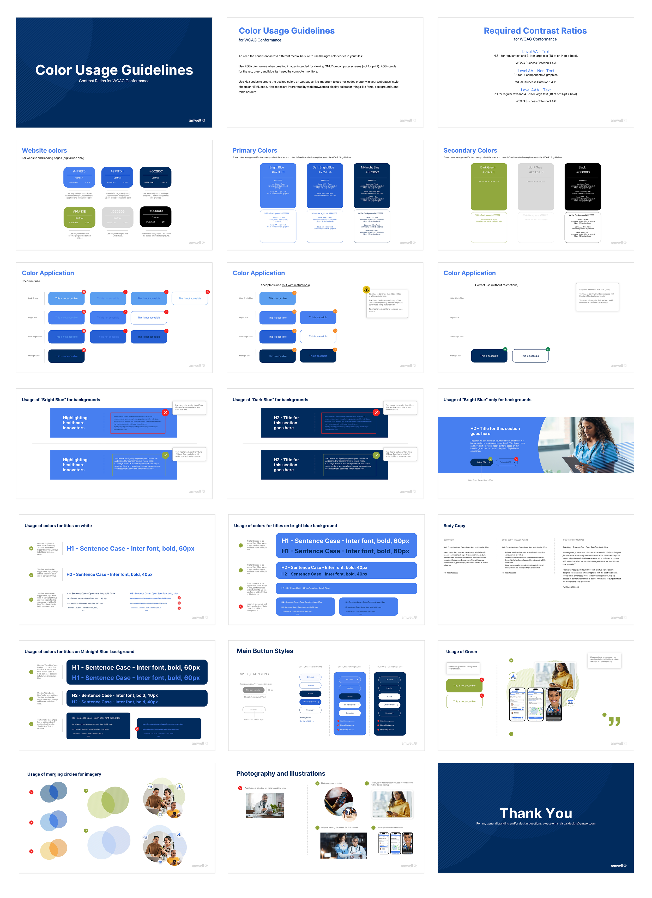
In redesigning the new website, we made accessibility a top priority by aligning with Web Content Accessibility Guidelines (WCAG) 2.0, 2.1, and 2.2 at Level AA. This commitment involved meticulously adhering to a range of technical and design requirements—including color contrast, color combinations, and font sizes—to ensure the website provides an inclusive, user-friendly experience for all, regardless of ability.
Project Overview:
Client: Amwell
Industry: Telehealth, Healthcare Technology
Role: Senior Graphic Designer, Project Manager
Duration: Q1 2024
Tools: Sketch, Adobe Photoshop, Adobe Illustrator, Excel, Word, Jira, Teams
Project Type: Website Redesign, UX/UI
The objective of this project was to evaluate, test, and develop comprehensive guidelines to ensure WCAG (Web Content Accessibility Guidelines) conformance. Achieving WCAG 2.0, 2.1, or 2.2 Level AA compliance was critical for accessibility, ensuring that all users, regardless of ability, could interact with the website effectively.
Challenge:
One of the primary challenges was the limitation of the original brand colors in terms of accessibility. The selected brand colors posed significant difficulties when it came to creating sufficient contrast ratios and ensuring proper color combinations, both essential for WCAG compliance. These limitations required an in-depth review and modification of the color palette to balance brand identity with accessibility requirements.
Approach:
To address the challenge, my approach focused on a comprehensive review and testing of color ratios and combinations. I conducted rigorous tests across various tools to analyze how different color tones would impact both print and digital assets. The goal was to ensure that the colors used on the website met the necessary contrast ratios for text and background elements, ensuring legibility while maintaining the brand’s visual identity.
I also considered the broader implications for the entire company’s digital ecosystem, assessing how changes would affect other assets like marketing materials, presentations, and social media content. The translation of these color adjustments into various platforms was crucial for maintaining consistency and ensuring accessibility across the brand.
Color Palette Analysis and Testing:
In this phase, I developed a detailed presentation explaining how color ratio and combination directly impacted accessibility. The goal was to visually demonstrate how the selected colors would translate across different user environments, including devices with varying screen brightness and users with visual impairments.
I presented these findings to directors, managers, and developers, emphasizing the importance of implementing these guidelines across their teams. This collaborative approach ensured that everyone was aligned with the accessibility goals, from design through to development and beyond. By creating these clear, actionable guidelines, I ensured a smooth handoff and adherence to WCAG standards across all digital touchpoints.


