ICP-Analysis: Rebranding for Precision and Clarity
This rebranding project for ICP-Analysis focuses on modernizing the visual identity of an EPA-certified testing lab specializing in water quality analysis. By blending the technical precision of lab environments with the fluidity of water, the new brand reflects the company's commitment to innovation, sustainability, and expertise in ICP-OES testing. The rebrand included a refreshed logo, color palette, and website design to enhance the brand’s presence and connect more deeply with its audience.
Project Overview
Client: ICP-Analysis
Industry: Environmental Testing (ICP-OES Water Testing)
Service Provided: Graphic Design, Brand Strategy, Logo Redesign, Website Redesign concept
Role: Lead Graphic Designer
ICP-Analysis is an EPA-certified lab specializing in ICP-OES testing for saltwater and freshwater samples. While their scientific capabilities were top-notch, their brand felt outdated and overly focused on the lab and chemical aspects, rather than highlighting the water quality and human impact of their work.
They approached me to lead a rebranding effort, starting with a logo redesign and a foundational framework for a website overhaul. I collaborated closely with their team of designers, marketers, and developers, guiding the process and providing design direction. My goal was to ensure the new brand and website reflected their expertise, while also incorporating elements of water, the environment, and their impact on the community.
Challenges
ICP-Analysis faced several key challenges that needed to be addressed:
Outdated Brand Identity: Their previous logo and design lacked the modern, fluid feel that could represent their focus on water analysis. It didn’t convey the scientific precision or the importance of water quality they wanted to showcase.
Poor Website Experience: The existing website was difficult to navigate, lacked responsiveness, and failed to engage visitors. The site didn’t reflect the company’s position as a leader in the field.
Visual Identity Disconnect: The brand’s visual elements didn’t communicate the science and expertise behind their work in a way that felt cohesive or aligned with their industry.
Strategic Approach
The rebranding strategy was designed with a focus on fluidity and connection to water, reflecting both the technical process of ICP-OES testing and the natural element of water at the heart of their business.
Logo Redesign:
The new logo combines fluid, wave-inspired elements with the precision of scientific analysis, symbolizing both the process of water testing and the dynamic nature of water itself. The logo seamlessly merges the image of a globe with water, highlighting ICP-Analysis’s global reach and focus on water quality.
The color palette, composed of blues and greens, evokes feelings of trust, clarity, and environmental responsibility. The blues represent purity and scientific precision, while the greens emphasize the company's commitment to sustainability and water quality.
The typography was refined with clean, modern lines and a gentle curvature, reflecting the smooth flow of water while maintaining a professional and calm aesthetic. This logo redesign captures the essence of both science and nature, reinforcing the brand’s expertise and focus on environmental impact.
Website Redesign:
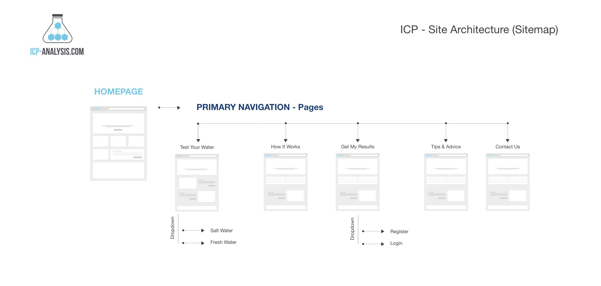
I developed the sitemap and homepage for ICP-Analysis, focusing on enhancing usability while reinforcing the aquatic theme. Fluid patterns and wave imagery were strategically integrated into the design to evoke the core service of water testing.
The homepage layout was crafted for simplicity and ease of navigation, presenting ICP-Analysis’s services in a clear, digestible format with intuitive calls to action. Visual elements like icons and background textures were used to subtly mimic the appearance of water, creating an immersive experience.
Though my involvement was primarily in guiding the structure and design, the framework I provided ensures a cohesive, mobile-responsive foundation that supports ICP-Analysis's goals and allows their internal team to build and expand upon it.
Branding & Visual Language:
A consistent fluid visual language was established across all brand materials, ensuring that the water theme was carried through to brochures, reports, and other collateral.
The design incorporated wave patterns, water textures, and smooth gradients throughout the site to mirror the natural flow of water, while still keeping the visuals clean and scientifically precise.
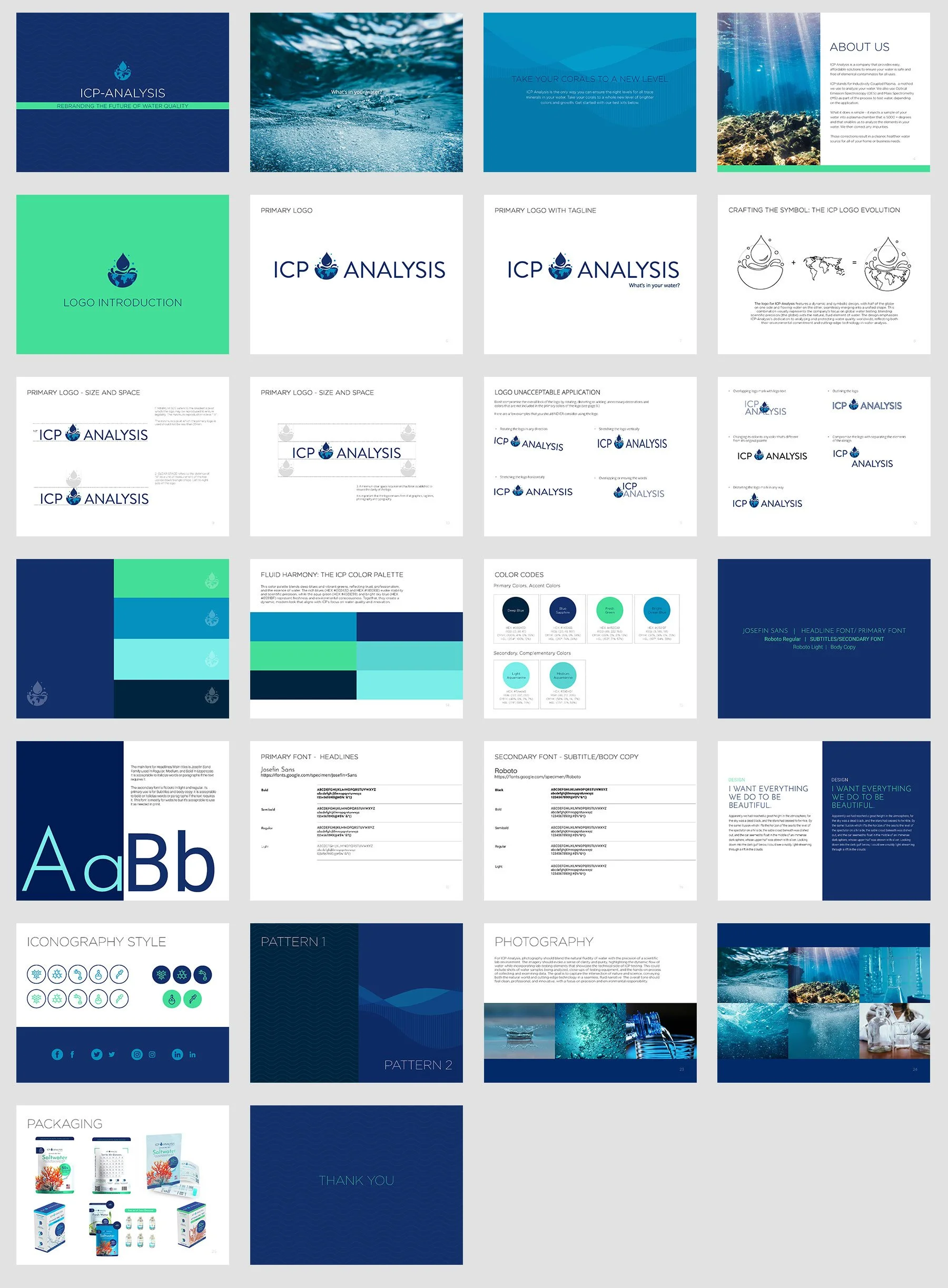
A comprehensive brand style guide was created, ensuring that all future marketing materials maintained a consistent visual identity across print and digital media.
Solution & Execution
The project was carried out in three main phases:
Logo Development: The new logo was designed to evoke both the fluidity of water and the scientific precision of ICP-OES testing. The result was a modern, dynamic mark that clearly conveyed the company’s core service while remaining versatile for use across multiple platforms.
Website Redesign: I worked closely with the ICP-Analysis team to develop a new sitemap and homepage, providing a strong foundation for their internal project. The design focused on creating a seamless user experience, incorporating wave-inspired visuals and a clean, modern layout. With intuitive navigation and clear calls to action, the homepage serves as a guide to enhance engagement and direct users to key content. I provided a solid framework, allowing the ICP team to build upon it while ensuring the brand’s visual identity and user needs were front and center.
Brand Guidelines: A full brand style guide was developed, incorporating everything from color palettes and typography to imagery usage, ensuring consistency across all future collateral and communications. The guide provided a framework for maintaining a unified look, both online and offline.
Results & Impact
Since the rebranding, ICP-Analysis has seen several positive outcomes:
Stronger Brand Recognition: The new logo and cohesive visual identity have helped the company present a more professional, modern image, which is resonating well within the scientific and environmental sectors.
Improved User Engagement: The website redesign has made it easier for users to navigate the site and learn more about the services. This has led to a noticeable increase in site visits, engagement rates, and inquiries.
Enhanced Business Growth: The redesigned website and visual identity have contributed to higher client conversion rates, as the clear and professional presentation of services has helped potential customers gain trust in the company's expertise.
Conclusion
The rebranding of ICP-Analysis successfully captured the fluidity and precision that are central to their water testing services. By focusing on water-inspired design elements and creating a cohesive, modern visual identity, I helped elevate ICP-Analysis’s brand to reflect their position as a leader in environmental testing. This project highlights the power of design in transforming not only a company’s image but also their ability to engage with their target audience effectively.


