Arine – Enhancing Brand Identity with Motion and Illustrations
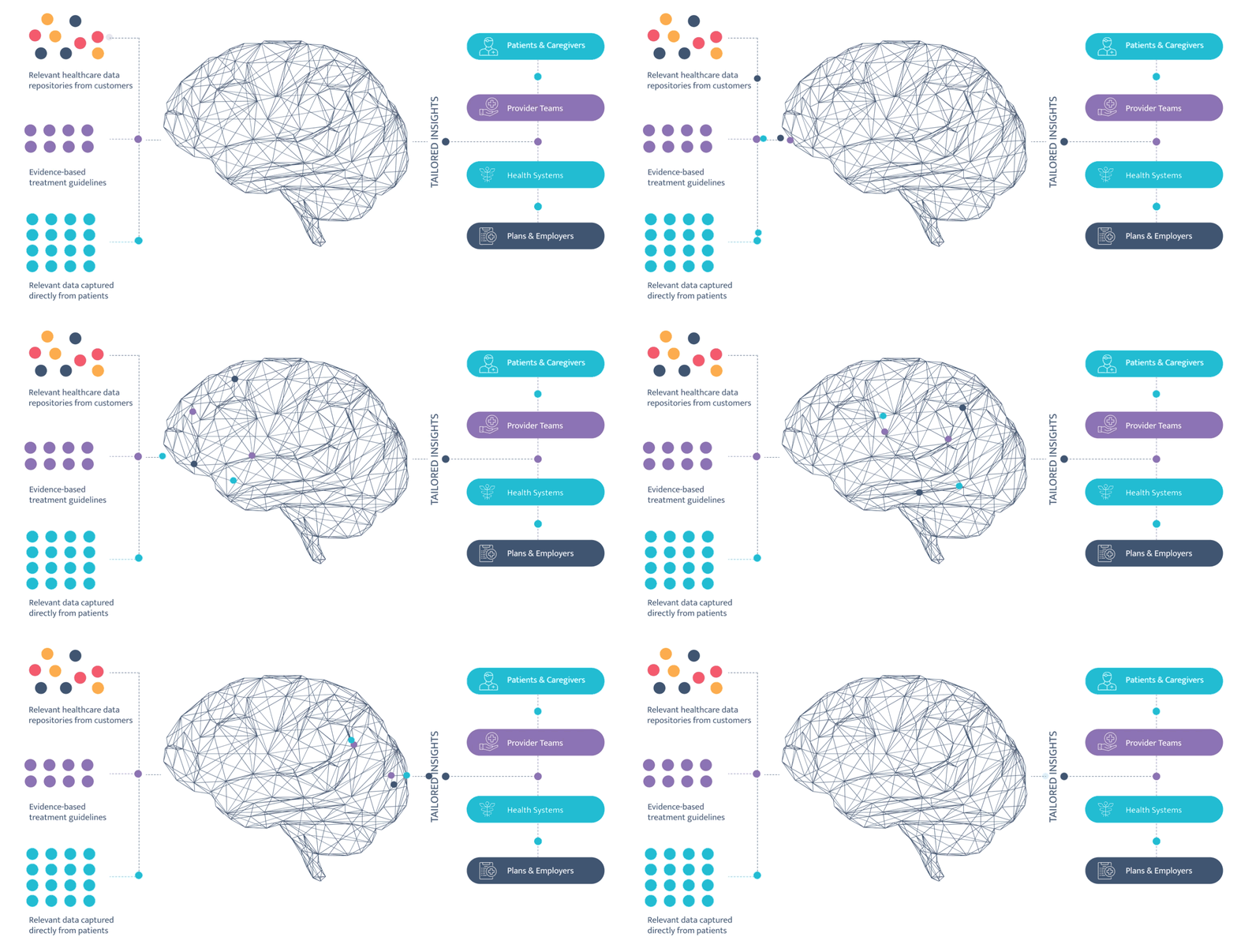
This case study highlights a clean and minimalistic infographic animation created for Arine’s homepage. Designed to support Arine’s modern branding, the animation features a stylized brain illustration with smooth, simple motion to help convey key concepts of Comprehensive Medication Management. The goal was to create a visually engaging and streamlined experience that reinforced Arine's brand identity while presenting important information in an accessible way.
Overview
For Arine’s homepage, I created a visually engaging and minimalistic infographic animation, incorporating both simple animation and custom illustrations. The goal was to communicate Arine’s innovative approach to Comprehensive Medication Management, using clean and modern visuals that aligned with the brand’s sophisticated identity. The illustration and animation combination aimed to simplify complex concepts while maintaining an engaging and smooth user experience.
Challenge
The primary challenge was to develop a design that not only conveyed a sophisticated and clear message but also complemented Arine’s modern branding. The animation needed to be minimalistic yet engaging, and the illustrations had to fit seamlessly into the visual language. Key challenges included:
Brand Consistency: Maintaining a modern and professional look while aligning with Arine’s existing visual identity.
Simplifying Complex Concepts: Creating visuals that effectively explained the intricate topic of medication management without overwhelming the viewer.
Engagement: Designing a seamless flow of visuals that would capture the attention of visitors and help them understand the key messages with clarity.
Process:
Conceptualization & Design:
Worked closely with the client to understand their branding and messaging goals.
Designed a series of custom illustrations that visually represented key elements of Comprehensive Medication Management, ensuring they aligned with the brand’s visual language.
Animation & Motion Design:
Developed a smooth, simple animation sequence for the homepage, focusing on minimal movement to highlight key concepts while maintaining a clean, elegant flow.
Integrated the illustrations into the animation, with subtle transitions and interactions, creating an engaging yet informative visual experience.
Review & Refinement:
Collaborated with the Arine team to refine the illustrations and animation based on feedback, ensuring the visuals aligned perfectly with the brand’s tone and messaging.
Adjusted animation timing and visual elements to ensure a smooth, cohesive experience for users.
Results
The final animated infographic successfully supported Arine’s branding, helping convey a complex healthcare concept in a simple and engaging way.
Visual Impact: The minimalistic animation and clean illustrations enhanced the brand’s sophisticated look while effectively communicating key messages.
User Engagement: The engaging animation, paired with clear illustrations, improved user understanding and increased interaction on Arine’s homepage.
Brand Alignment: The design maintained brand consistency, reinforcing Arine’s modern and professional image while simplifying the presentation of complex medical concepts.
Key Takeaways
Balanced Simplicity & Engagement: The success of the project was driven by the ability to balance minimalistic design with dynamic motion, making complex concepts more accessible.
Illustration-Driven Communication: Custom illustrations added a personal, creative touch that helped clarify key concepts without overwhelming the viewer.
Brand Support: The project helped strengthen Arine’s brand presence, using visually appealing motion graphics and illustrations to communicate their message in a cohesive, branded experience.


